
Thursday, December 15, 2011
Black Belt Society Blog: General - Twilight (Intro) Video by RC Designs
Black Belt Society Blog: General - Twilight (Intro) Video by RC Designs: Check out the video for Twilight (Intro) off of General 's debut mixtape entitled Director's Cut . The video was edited by RC Designs . Enj...
Thursday, November 3, 2011

Thursday, August 18, 2011


Friday, June 10, 2011
DJRC Presents: General: Who Framed Roger Rabbit ft. Infinite (THE SINGLE) off of General's Upcoming Mixtape "Director's Cut"

Warning: The content in this mixtape is not suitable for all ages.
All the images used in this blog post are Copyright "rickcarrolldesigns"
Saturday, May 21, 2011
5/27, DJRC Presents: Tuan Ya Boi- Memoirs Of A Notebook (THE MIXTAPE) (Album Art And Mixtape Link)
http://www.hotnewhiphop.com/en/view-album/14325-djrc-presents%3A-tuan-ya-boi--memoirs-of-a-notebook-

Back Cover:

[Rick Carroll]
Friday, May 13, 2011
Final Project: 10 3/4" x 7 1/4" DVD Cover, Case, and Disc: DJRC Presents: So Saucy (Promo DVD)
For my final project in my Digital File Prep. class I designed a full bleed, full color, DVD cover. The DVD case contains a professionally authored disc including Micah Handley Jr. aka "So Saucy's" "Livin' It Up (THE MIXTAPE)" that I produced, and two 1080p High Definition Videos that I also produced. The authored disc was my final project in my Multimedia Authoring class. It is great that I can do something in my classes that will benefit me in the real world. So Saucy and I will take these authored discs to radio stations and producers as promo pieces to set up shows and spread So Saucy's music.
I had proofs for this project printed at Quickprint, the Pitt State on campus printer. It cost me $2 for 5 proofs. I was quoted $20 for 50 prints of the cover. Originally we tried to print a proof of my DVD cover on 8.5" x 11" #32 mowhawk glossy paper. That did not work because ultimately the piece becomes more than 11" wide with the bleed accounted for. The printer shrunk my proof and it was not the correct size. We then had to change the paper to 11" x 18" #32 mowhawk glossy paper. The project printed great this time around and they even made the cuts for me. The finished product looks outstanding. Just what I expected.
Here is an example of my thumbnail sketches for this piece:

Here is an example of my rough sketch for this piece:

Here is an example of my folding dummy for this piece:

Here is an example of the final PDF screenshot:

Here is an example of the final finished product:

Here is an example of the printed disc:

Remember you can listen to and download the mixtape:
http://www.datpiff.com/So-Saucy-Livin-It-Up-the-Mixtape.214349.html
Warning: The content in this mixtape is not suitable for all ages.
As for my Digital File Prep class overall, I must say it was the most deadline based, stressful, real life version of a class I've ever had. I learned about graphic design and what it's really like to be in the industry. I learned how to prepare files digitally for print, and I learned that printing and outputting pieces is way harder than one would imagine. There are so many errors that can take place in a printing process and it can be the printers fault or the designers fault. Sometimes it's up to debate as to whose fault it is when an error occurs. It was also eye opening that printing costs money and people get very angry when they have to pay for mess ups and pay for the correct copies on top of the errors. Jobs can be extremely expensive and if they all print wrong it can be deadly. I liked this class a lot even though it stressed me out and I'm being honest when I say that I learned more in this class than I learned the rest of my schooling. If every class was like this one I wouldn't mind school as much.
All the images used in this blog post are Copyright "rickcarrolldesigns"
[Rick Carroll]
Thursday, March 31, 2011
3 Column Wide, 5" Tall, Collegio (Newspaper) Display Ad: Thumbs, Rough, Target Audience, Call To Action, Final Piece
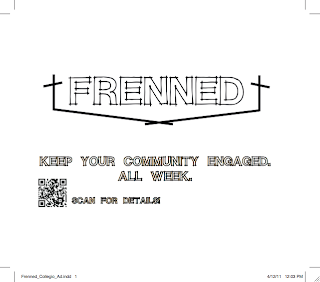
This particular school project for my Digital File Prep. class is a 3 column wide, 5 inch tall newspaper ad designed to go in the Collegio (the Pitt. State Newspaper). The ad contains information promoting the "Frenned" service www.frenned.com that churches use to connect their members daily via social media filters (using bible verses).
I had to calculate the cost of my ad based on the size of it. I decided my ad should be 3 newspaper columns wide which equates to 5.75 inches. I then decided that it would be best if it was almost sqaure. So naturally I chose to go with 5 inches for the height. The cost per column inch is $4 in this situation. So these 15 column inches that I am using will ultimately cost me $60 to use. There are no bleeds in this particular piece because the ad sits inside a border.
The target audience for this piece is churches who would be interested in signing up for the service, and for any 12-40 year old individual who attends a church regularly and wants to promote the service to their church.
The call to action for the piece is to get people to scan a QR code located on the bottom left of the ad that will take them directly to the site that pertains more information about the service.
Here is an example of my thumbnail sketches:

Here is an example of my rough sketch:

Here is a screenshot of the finished product as a pdf file:
All the images used in this blog post are Copyright "rickcarrolldesigns"
[Rick Carroll]
I had to calculate the cost of my ad based on the size of it. I decided my ad should be 3 newspaper columns wide which equates to 5.75 inches. I then decided that it would be best if it was almost sqaure. So naturally I chose to go with 5 inches for the height. The cost per column inch is $4 in this situation. So these 15 column inches that I am using will ultimately cost me $60 to use. There are no bleeds in this particular piece because the ad sits inside a border.
The target audience for this piece is churches who would be interested in signing up for the service, and for any 12-40 year old individual who attends a church regularly and wants to promote the service to their church.
The call to action for the piece is to get people to scan a QR code located on the bottom left of the ad that will take them directly to the site that pertains more information about the service.
Here is an example of my thumbnail sketches:

Here is an example of my rough sketch:

Here is a screenshot of the finished product as a pdf file:

All the images used in this blog post are Copyright "rickcarrolldesigns"
[Rick Carroll]
Monday, March 28, 2011
#DJRC presents: So Saucy- Livin' It Up (THE MIXTAPE)
Over spring break my good friend Micah Handley approached me and told me he wanted me to produce his mixtape. He said he had lots of beats/instrumentals picked out and that he had a large amount of content (verses/and hooks) written. He had a really good idea of what he wanted to accomplish with this mixtape and the meanings and lyrics really hit home for everyone that was around/involved in the recording process.
Micah Handley Jr. aka. "So Saucy" has really developed his sound in the last year and his lyrics mean something. So Saucy's music makes a HUGE statement and in my opinion as a producer he is an artist that can be extremely competitive and intimidating in the music industry.
So Saucy's mixtape is complete with seventeen fully mixed and mastered tracks, and album artwork for the front and back covers. Currently the songs for the mixtape are available for free download and streaming access via my YouTube channel and DatPiff.
There is an HD music video for a song on the mixtape in the works and it will be released within the next couple months.
Warning: The content in this mixtape is not suitable for all ages.
Here is an example of the front of the mixtape (album artwork):

Here is an example of the back of the mixtape (album artwork):
 Here is a link to the free download!:
http://www.limelinx.com/files/
http://www.datpiff.com/So-Saucy-Livin-It-Up-the-Mixtape.214349.html
All the images used in this blog post are Copyright "rickcarrolldesigns"
[Rick Carroll]
Micah Handley Jr. aka. "So Saucy" has really developed his sound in the last year and his lyrics mean something. So Saucy's music makes a HUGE statement and in my opinion as a producer he is an artist that can be extremely competitive and intimidating in the music industry.
So Saucy's mixtape is complete with seventeen fully mixed and mastered tracks, and album artwork for the front and back covers. Currently the songs for the mixtape are available for free download and streaming access via my YouTube channel and DatPiff.
There is an HD music video for a song on the mixtape in the works and it will be released within the next couple months.
Warning: The content in this mixtape is not suitable for all ages.
Here is an example of the front of the mixtape (album artwork):

Here is an example of the back of the mixtape (album artwork):

http://www.limelinx.com/files/
http://www.datpiff.com/So-Saucy-Livin-It-Up-the-Mixtape.214349.html
All the images used in this blog post are Copyright "rickcarrolldesigns"
[Rick Carroll]
Shorty's Mow N' Snow: Projects
In the past I have done work with the company Shorty's Mow N' Snow. They are a landscaping, lawn care, and snow removal company. We have built a strong relationship and created a logo that makes a strong statement and seems to have everyone involved satisfied. Not only did I create the logo, I designed a few other things for the company that I thought would help benefit them.
Here is an example of the Shorty's Mow N' Snow logo that exists on all their business cards and represents the company in a creative and professional fashion:

Here is an example of an image I designed that we decided would look great on t-shirts and possibly some truck magnets:

In this particular piece I decided that since it was going to be for shirts and/or truck magnets that the best way to create it was to incorporate everything that the company does. Notice the shovel on the bottom left representing the snow removal, and the lawn mower on the lower right representing the lawn care. The trees and bushes strongly represent the landscaping portion of the company and last but not least the text is my favorite part of this piece. We still haven't decided if we will use this for shirts and/or magnets but I love the piece and I consider it very useful.
You can check out the Shorty's Mow N' Snow testimonial on the left side of the screen in the testimonials section.
All the images used in this blog post are Copyright "rickcarrolldesigns" and "Shorty's Mow N' Snow"
[Rick Carroll]
Thursday, March 10, 2011
Fashion Show Music Project: STA Mothers Club Fashion Show
Fashion Show

March 6, 2011 at 11:00 AM
The Ritz Charles
9000 W. 137th Street, Overland Park, KS
The Ritz Charles
9000 W. 137th Street, Overland Park, KS
Just recently I spent quite a large amount of time mixing and mastering an hour and ten minute long project for the Saint Thomas Aquinas Catholic High School Spring Fashion Show. It was a time consuming project in which I had to edit out inappropriate content and mix every single transition but it was a good learning experience and a pretty fun project. I will say that during this project I was fairly fond of the song "Somebody To Love" by: Usher and Justin Bieber. I may have caught a tiny bit of the "Bieber Fever". I know my sister would be proud. :)
Anyways, here is a link to the music! Enjoy!
http://www.limelinx.com/files/b397953ee3242a18cc057c4336f96db6
[Rick Carroll]
Wednesday, March 9, 2011
Technical/Professional Writing: What I'm Learning, Projects We Have Done
This semester Technical/Professional writing has helped me a lot. It is a fairly stressful deadline based class but I must say it is fully preparing me for the industry and what I need to know to be successful. We have done so much so far and I'm looking forward to learning more. These are the projects we have done so far and the projects we are yet to be assigned. I expect to be able to reproduce all these projects in real life situations in the future.
***Bold Text indicates completion***
- Claim Letter
- Resume
- Job Cover Letter and ad
- Electronic Cover Letter and Resume
- Adjustment Letter
- Memo 1: (w/definitions)
- Memo 2: (w/a table)
- Memo 3: (w/a chart)
- Process Description
- Mechanism Description
- Formal Group Report and Electronic Presentation
- Instructions
- Informed Participation
[Rick Carroll]

Thursday, March 3, 2011
6 x 4.25 Postcards (Photoshop Formats)
This post specifically contains instructions and examples of Adobe Photoshop files that I may need to reproduce in the future.
These photos were brought into an Adobe InDesign file from Photoshop and placed at 100%. The .125" bleed was considered as well as the .25" margins in all the files in InDesign and Photoshop.
Grayscale Raster | full bleed | Save as flattened eps or tif | color mode: grayscale
 300 resolution and 1/8 inch bleed built into my Photoshop file.
For a 6 x 4.25 inch post card cover, my PS file measures 6.25 x 4.5 to accommodate bleed on all four sides.
Duotone Raster | full bleed | Only save as eps | color mode: Duotone
I used PMS 116 + black for my duotone
 300 resolution and 1/8 inch bleed built into my Photoshop file.
For a 6 x 4.25 inch post card cover, my PS file measures 6.25 x 4.5 to accommodate bleed on all four sides.
Four Color Raster | full bleed | Save as flattened eps or tif | color mode: CMYK
 300 resolution and 1/8 inch bleed built into my Photoshop file.
For a 6 x 4.25 inch post card cover, my PS file measures 6.25 x 4.5 to accommodate bleed on all four sides.
COB created using a clipping path in Photoshop | Only save as eps
 300 resolution and 1/8 inch bleed built into my Photoshop file. A COB cannot be a full bleed, but if it bleeds of any side, I need to account for this by building it in, in PS. My COB can be created from any of the above color modes; duotone, grayscale or cmyk.
All the images used in this blog post are Copyright "rickcarrolldesigns"
The "Winterscape068" photo that I used I pulled from the PSU Elements to Copy folder. I have permission to use this photo.
[Rick Carroll]
These photos were brought into an Adobe InDesign file from Photoshop and placed at 100%. The .125" bleed was considered as well as the .25" margins in all the files in InDesign and Photoshop.
Grayscale Raster | full bleed | Save as flattened eps or tif | color mode: grayscale

For a 6 x 4.25 inch post card cover, my PS file measures 6.25 x 4.5 to accommodate bleed on all four sides.
Duotone Raster | full bleed | Only save as eps | color mode: Duotone
I used PMS 116 + black for my duotone

For a 6 x 4.25 inch post card cover, my PS file measures 6.25 x 4.5 to accommodate bleed on all four sides.
Four Color Raster | full bleed | Save as flattened eps or tif | color mode: CMYK

For a 6 x 4.25 inch post card cover, my PS file measures 6.25 x 4.5 to accommodate bleed on all four sides.
COB created using a clipping path in Photoshop | Only save as eps

All the images used in this blog post are Copyright "rickcarrolldesigns"
The "Winterscape068" photo that I used I pulled from the PSU Elements to Copy folder. I have permission to use this photo.
[Rick Carroll]
7 x 5 "Variable Data Direct Mail" Piece- Word Matrix, Roughs, Thumbs, Final Piece
This school project is a variable data direct mail piece for my digital file prep class.
The target audience consists of 18 yr old to 25 yr old, male and female, UNL (Nebraska) students who live on, or close to campus.
The call to action for this piece is to get the people included in the target audience to attend the "event X" at "nuVibe Juice and Java" in Lincoln on March 18th from 5-6 pm. At the "event X", The business would be giving away 30 free smoothies as long as you asked for "THE PRINCE" which refers to the athlete Prince Amukamara (First 30 are free). Prince was a defensive back at UNL and is currently working hard and participating in the NFL Combine to improve his NFL Draft status.
Here is an example of the word matrix I designed. This helped me determine the target audience, purpose, and call to action:

Here is an example of the thumbnails I designed. These helped me brainstorm and think about what content would be fitting for the piece:

Here is an example of the rough sketches I designed. Once again these helped me brainstorm further to determine the content that would be fitting for the piece:

Here is an example of the finished file. This is what the piece should look like when it is sent in the mail and the variable data fields are filled with content from the database.

Here is an example of the PDF file with crop marks and bleed indicated.

The variable fields that change in this particular piece are the first name on page two (Crista) and the photo below that section of text (the smoothie photo). On the male demographic the male first name would be filled in that particular field and instead of the smoothie photo there would be another photo of prince in that section.
All the images used in this blog post are Copyright "rickcarrolldesigns"
[Rick Carroll]
Tuesday, March 1, 2011
5 x 7 "Self Promotion" Notepad- Call to action, Target Audience, Purpose, Thumbs and Rough, Final Version Image
This particular project is a self promotion notepad for my Digital File Prep class.
The target audience consists of anyone who I would want to show my Illustrator skills to, to show them the types of software that I am capable of using, social media filters that I incorporate my work into, and some of the mulitmedia devices that I use to create content. This notepad also has my contact information in case a potential client wanted to get a hold of me, or if a potential employer wanted an interview, etc. Another very cool part of this notepad is the QR code located in the upper left section of the notepad. If this QR code is scanned, it will use the information to take the scanner directly to this blog where eventually all my work will be included. This is very cool technology.
The call to action for this notepad is to make myself reachable to potential clients or employers. (Self Promotion)
This project costs only $3.25 to make. It is a 50 sheet, chipboard backed notepad. I went to the Pittsburg State on campus printer "QuickPrint" to get this job printed. They told me it would take one business day and they were right on the money with following up with that commitment.
Here is an example of my thumbnails for this project:

Here is an example of my rough sketch for this project:

Here is an example of the word matrix I created to determine the content of my notepad:

Here is an example of the final PDF formatted version of my notebook:

When I originally created this notepad I designed it to bleed off the page. Upon communicating with the printer, (QuickPrint) we determined that the cost would be less to run the job without bleeding. Since this particular notepad is just a school project I decided to save my money and run the job without bleed. I redid my PDF, and this is what I got! I'm very happy with how it turned out!


All the images used in this blog post are Copyright "rickcarrolldesigns"
[Rick Carroll]
Monday, February 21, 2011
My First Post!
This will be the site that I use to post all my projects for school, freelance work, etc.
Subscribe to:
Posts (Atom)